
Home >> Our Blogs >>UI/UX Design Mistakes That Are Killing Your Website Conversions
Introduction
Traffic is often treated as the finish line of a marketing effort — get people to the website and the job is done. In reality, traffic is only the halfway point. A visitor who lands on a confusing, slow, or cluttered website rarely converts, no matter how well the ad, email, or search result that brought them there was written. The gap between a visit and a sale is almost entirely decided by design, and most businesses never audit that gap until revenue has already been lost for months.
This article walks through the UI/UX mistakes that quietly cost the most conversions — not abstract design theory, but the specific, fixable issues that show up again and again on business websites across every industry.
Why Design Is a Revenue Problem, Not Just an Aesthetics One
It's tempting to treat UI/UX as a polish step — something nice to have once the "real" marketing work is done. But design decisions directly control whether a visitor understands what's being offered, trusts the business enough to act, and can complete that action without friction. A beautifully designed ad campaign driving traffic to a confusing landing page is, in effect, paying to generate visitors who leave without converting. Fixing design issues is frequently the single highest-leverage change available to a website, because it improves the outcome of every other marketing channel at once rather than just one.
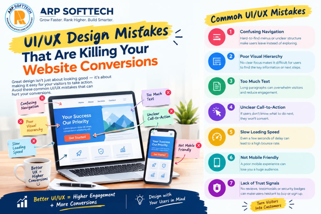
Mistake 1: Cluttered or Unclear Navigation
When visitors can't quickly find what they're looking for, most don't dig deeper — they leave. Overloaded menus with a dozen top-level items, inconsistent labeling, and navigation that buries the most important pages several clicks deep are among the most common ways websites quietly lose visitors in the first ten seconds.
A navigation structure that works lists only the handful of destinations that matter most, uses labels a visitor would actually recognize rather than internal jargon, and keeps the path to a purchase or contact page no more than one or two clicks away from anywhere on the site.
Mistake 2: Weak or Buried Call-to-Action Buttons
A call-to-action button that blends into the background, uses vague text like "Submit" instead of a clear action ("Get My Free Quote"), or sits below content a visitor never scrolls to see, fails at the one job it has. Color contrast, button size, and placement all directly affect whether a visitor's eye is drawn to the next step or has to hunt for it.
It's also worth testing how many calls-to-action appear on a single page. Too few leaves visitors unsure what to do next; too many competing buttons create decision paralysis. One clear primary action per page, repeated at natural points as the visitor scrolls, tends to outperform a page cluttered with equally weighted options.
Mistake 3: Slow Page Load Speed
Every additional second a page takes to load measurably increases the chance a visitor leaves before it even finishes rendering. Unoptimized images, excessive third-party scripts, and bloated page builders are the usual culprits. Page speed isn't purely a technical metric either — it's one of the clearest, most measurable UX issues a website can have, because a slow page actively punishes every visitor equally, regardless of how good the design underneath it is.
Mistake 4: A Mobile Experience That Was Clearly an Afterthought
A website designed primarily for desktop and then awkwardly squeezed onto a phone screen is painfully easy to spot — tiny tap targets, text that requires zooming, forms that are tedious to fill out with a thumb. With the majority of traffic for most businesses now arriving on mobile devices, this isn't a secondary concern; for many sites, it's the primary experience almost everyone actually has.
A properly responsive design built mobile-first, rather than adapted after the fact, consistently converts better because every element was actually designed for the device most visitors are using, not just resized to technically fit it.
Mistake 5: Forms With Too Much Friction
Every additional field on a form is a small opportunity for a visitor to reconsider and abandon it. Asking for a phone number, company size, and three other details when only an email address is actually needed to start a conversation adds friction without adding value. The businesses that convert best tend to ask for the absolute minimum upfront and gather additional details later in the relationship, once trust has already been established.
Checkout flows deserve the same scrutiny. Forcing account creation before a purchase, hiding shipping costs until the final step, or requiring unnecessary re-entry of information a visitor already provided are all small frictions that add up to meaningfully lower completion rates.
Mistake 6: Inconsistent or Missing Visual Hierarchy
Visual hierarchy is what tells a visitor's eye where to look first, second, and third on a page. When every element — headlines, body text, buttons, images — competes for equal attention, nothing actually stands out, and visitors are left to figure out the structure themselves, which most won't bother doing. Clear size, weight, color, and spacing differences between what matters most and what's secondary make a page scannable rather than something that has to be read in full to be understood.
Mistake 7: Missing or Weak Trust Signals
Visitors who have never interacted with a business before are naturally cautious, especially before entering payment or contact information. Reviews, client logos, certifications, security badges near payment fields, and a visible, real address or phone number all reduce that hesitation. Their absence doesn't necessarily cause active distrust, but it removes the small reassurances that often tip an undecided visitor toward completing an action rather than leaving to "think about it."
The Bonus Mistake: Designing by Opinion Instead of Data
Many design decisions on business websites are made based on personal preference — what a founder or manager personally likes — rather than how real visitors actually behave. Tools like heatmaps, session recordings, and simple A/B tests reveal where visitors actually click, where they hesitate, and where they drop off, often surfacing issues that would never have been guessed from opinion alone. A website redesigned around actual user behavior data consistently outperforms one redesigned purely around aesthetic taste.
How to Audit Your Own Website
Time the homepage and a key product/service page loading on an average mobile connection, not just office wifi
Ask someone unfamiliar with the business to find a specific page or complete a specific action, and watch where they hesitate
Count the number of fields on your main contact or checkout form, and question whether each one is truly necessary upfront
Check color contrast on buttons and key text against accessibility standards, not just how it looks on a bright office monitor
Review heatmap or scroll-depth data, if available, to see whether visitors are actually reaching your calls-to-action
Fixing These Issues Without a Full Rebuild
Most of these problems don't require starting over from scratch. A focused audit followed by targeted fixes — tightening navigation, redesigning a handful of key pages, addressing speed bottlenecks — often delivers a meaningful conversion lift far faster and cheaper than a full redesign. That said, when a site's underlying structure is genuinely holding it back, a more thorough website development project, paired with deliberate UI/UX design work, tends to pay for itself quickly once the conversion improvement is measured against the cost of continuing to lose visitors who were already paid for through ads or SEO.
Design and Marketing Have to Work Together
A conversion problem is rarely purely a design issue or purely a marketing issue — the two constantly affect each other. Traffic earned through SEO or PPC campaigns is only as valuable as the page it lands on allows it to be. Reviewing design and marketing performance together, rather than as separate departments reporting separate numbers, usually surfaces fixes that neither team would have found working in isolation.
Frequently Asked Questions
How do I know if my website has a UX problem versus a traffic problem?
If visitors are arriving (traffic is healthy) but bouncing quickly or abandoning forms and carts, that's a strong signal the issue sits with the on-site experience rather than how visitors are being attracted in the first place.
What's the fastest UX fix with the biggest impact?
Page speed and call-to-action clarity tend to deliver the quickest, most measurable improvements, since both directly affect every visitor equally and are usually fixable without a full redesign.
How often should a website's UX be reviewed?
A light review every few months and a deeper audit at least once a year is a reasonable baseline, though a sudden drop in conversion rate at any time is worth investigating immediately rather than waiting for a scheduled review.
Does good UX design help SEO too?
Yes — page speed, mobile usability, and low bounce rates are all factors search engines consider, so many UX improvements support better rankings as a side effect, not just better conversion rates.
Getting Started
Fixing conversion-killing design issues usually starts with a clear-eyed look at where visitors are actually dropping off. ARP SoftTech offers UI/UX design and website development services built around exactly this kind of audit-first approach, and businesses can explore available SEO packages if design fixes need to be paired with a visibility strategy. For a specific review of an existing website, get in touch to discuss what's actually holding current traffic back.
Conclusion
Most websites don't lose conversions because of one dramatic flaw — it's usually a combination of small frictions that quietly add up: a slow load here, a buried button there, a form that asks for too much too soon. None of these mistakes are difficult to understand once identified, which is exactly why a proper audit is worth doing before spending another rupee driving more traffic to a page that was never going to convert it well in the first place.